

Ever wondered why certain brands use bold reds, calming blues, or energizing yellows in their ads? That’s not a coincidence — it’s color psychology at work. Colors aren’t just pretty; they play a powerful role in how we feel, think, and shop. Marketers use specific colors to grab attention, build trust, and even influence your buying decisions.
By the end, you’ll know exactly why that sale banner was red—and you’ll have clear steps for using color to make your brand stand out.
The Science of Color Psychology
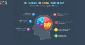
So, how does color psychology actually work its magic? It all starts in your brain. When your eyes perceive a color, such as a bright, sunny yellow, they send a message to a part of your brain that handles emotions and memories. This process can create powerful emotional triggers that influence your mood and even your consumer behavior without you even noticing.
Your Brain on Colors
Think of it like this: certain colors have connections in our minds that we’ve learned over time. We often associate blue with the calm sky or a peaceful ocean, which can evoke a sense of relaxation. On the other hand, red can grab our attention because it’s the color of fire trucks and stop signs, signaling urgency. This science helps marketers select colors that evoke a specific emotional response from their products.
Why We See Colors Differently
Have you ever argued with a friend about whether a color is blue or green? People perceive colors differently for many reasons, including cultural background. For instance, your age, gender, and where you grew up can influence how you perceive a certain shade. In some cultures, white is associated with weddings, but in others, it is reserved for funerals. These cultural experiences help explain why the same color can evoke different emotions in different people.
Practical Applications of Color Psychology in Marketing
Now for the fun part! Let’s see how you can use color psychology in the real world. This isn’t just theory; it’s about making smart choices that help your brand connect with people. From your logo to your latest post online, every color matters.
Choosing Colors for Your Brand Identity
Your brand’s colors are like its personality. Are you fun and energetic? Perhaps a bright orange or yellow would be a good fit. Are you calm and trustworthy? Blue could be your best friend. Successful branding uses color to tell a story. Think about how the green in the Whole Foods logo makes you think of nature and fresh, healthy food. Choosing the right colors helps people instantly understand what your brand is all about.
Supercharge Your Website and Social Media
Color plays a huge role in website design and social media marketing. A clean website with a simple color scheme can make visitors feel relaxed and focused, improving the user experience. On social media, a consistent color theme can make your profile instantly recognizable as people scroll through their feeds.
Creating Powerful Call-to-Action Buttons
Have you ever noticed how many “Buy Now” or “Sign Up” buttons are red or orange? There’s a reason for that! These colors create a sense of urgency and excitement, encouraging you to click. Using a standout color for your call-to-action buttons makes them stand out on the page, grabbing attention and guiding visitors to take the next step. A simple color swap can make a big difference in how many people click.
Book Our Web Development Services
Cultural and Contextual Considerations
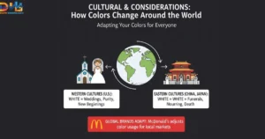
Did you know that a color that means one thing in your country might mean something completely different in another? This is a crucial aspect of color psychology. Our associations with colors are often shaped by where we grew up and the traditions we follow. For some, red is a lucky and festive color, while for others, it signals danger or warning. What might be a happy color to you could be a sad one for someone else.
How Colors Change Around the World
Let’s take the color white as an example. In many Western countries, such as the United States, white is often associated with weddings and purity, evoking thoughts of new beginnings. However, in some Eastern cultures, such as China and Japan, white is traditionally worn at funerals to symbolize mourning. Imagine a company using an all-white ad campaign to show happiness to a global audience. It might not work everywhere! This shows why understanding the cultural context of colors is crucial for marketers.
Adapting Your Colors for Everyone
So, how can a brand get it right? Before launching a product in a new country, smart companies conduct thorough research. They research what colors mean to the local people. This helps them avoid sending the wrong message. For example, the fast-food chain McDonald’s uses red and yellow worldwide, but they sometimes adjust the shades or how they are used to better fit local tastes. By being mindful of these differences, brands can ensure their message is understood and appreciated by everyone, regardless of their location.
Emotional Impact of Colors
Every color has its own personality, and understanding this is key to grasping the emotional impact of colors. Let’s examine how different hues can evoke emotions and how strategic color combinations can impact consumer behavior.
Decoding the Primary Colors
Primary colors are the building blocks, and each one packs a powerful emotional punch.
- Red: This is the color of energy, passion, and excitement. It’s a real attention-getter! Brands use red to create a sense of urgency, which is why you often see it on “Sale” signs. It can also make you feel hungry, which explains why food chains like McDonald’s and KFC use it.
- Yellow: Think of sunshine and smiley faces. Yellow is all about happiness, optimism, and warmth. It’s a cheerful color that can make you feel uplifted and creative. Brands often use yellow to convey a friendly and approachable image.
- Blue: If you want to feel calm and secure, look no further than blue. It’s the color of the sky and the ocean, and it evokes a sense of peace and relaxation. Companies like Facebook and many banks use blue to build trust and appear dependable.
The Influence of Secondary Colors
When you mix primary colors, you get secondary colors, and they have their own unique feelings, too.
- Green: This color evokes thoughts of nature, health, and new beginnings. It’s often used by brands that want to appear eco-friendly or fresh, such as Whole Foods.
- Orange: A mix of red’s energy and yellow’s happiness, orange is playful and enthusiastic. It’s great for brands that want to feel fun and confident, like Nickelodeon.
- Purple: For centuries, purple was the color of royalty. Today, it still represents luxury, wisdom, and creativity. Brands like Hallmark use it to convey a sense of specialness and sophistication.
Practical Applications of Color Psychology in Marketing

It’s time to apply what you know and use color intentionally to influence how people feel about your brand and inspire them to act.
Choosing the Right Colors for Your Brand
Your brand’s colors are like its outfit—they give a first impression. To choose the right ones, think about the personality you want your brand to have. Do you want to be seen as exciting and bold? Red might be your color. Want to appear trustworthy and calm? Blue is a great choice. The key is to match your colors to the feeling you want your customers to have.
Making Your Website Pop
Your website is your online home, and you want it to be a welcoming place. Use a main color that reflects your brand’s personality, then add one or two accent colors to highlight important information. For example, a calm blue background with a bright yellow accent can guide a visitor’s eyes exactly where you want them to go. This makes the website easy to navigate and visually appealing.
Creating Powerful Call-to-Action Buttons
Those small buttons labeled “Buy Now” or “Sign Up” are important. These are your call-to-action buttons, and their color can make a real difference. Help them stand out by choosing a color that contrasts with the rest of the page—like placing a bright orange button on a serene blue background. This draws the eye and encourages more clicks. It’s a straightforward and effective approach that can have a significant impact on results.
Cultural and Contextual Considerations
Did you know that a color that means one thing in your country might mean something completely different somewhere else? This is a crucial aspect of color psychology. The meaning of colors is influenced by cultural traditions and customs, often varying by region or country.
How Colors Change Around the World
For example, in many Western countries, such as the United States, white is a popular color for wedding dresses because it symbolizes purity and new beginnings. However, in some parts of Asia, including China and Japan, white is the color worn at funerals to represent mourning. If a brand isn’t careful, its color choice could send the wrong message to a global audience.
To connect globally, always research local color meanings before launching. Adapting lets your brand send the right message everywhere.
Advanced Strategies for Using Color Psychology
Ready to level up your color psychology skills? Once you’ve mastered the basics, you can use some advanced tricks to make your marketing even more powerful. These strategies will help you fine-tune your color choices and build stronger connections with your audience.
Test Your Colors with A/B Testing
How do you know for sure which color works best for your “Buy Now” button? You test it! A/B testing is like a color showdown. You create two versions of the same webpage, but with one small difference—like a red button on one and a green button on the other. You then show these two versions to different groups of people and see which button gets more clicks. This is a fantastic way to gather real data on which colors your audience responds to the most.
Stand Out with the Isolation Effect
Have you ever noticed how a single colorful object in a black-and-white photo immediately grabs your eye? That’s the Isolation Effect in action. This principle states that an item that stands out from its surroundings is more likely to be remembered and noticed. In marketing, you can use this by making your most important element—like a call-to-action button or a special offer—a color that contrasts sharply with the rest of the page. This makes it impossible to ignore!
Build Trust and Customer Loyalty
Colors can also help you build a lasting relationship with your customers. Using consistent colors across your brand—from your logo to your website and social media—makes your brand feel familiar and reliable. When people recognize your brand’s colors, they start to trust it more. For example, using calming and stable colors like blue and green can make your brand feel dependable, which is a great way to build customer loyalty over time. People stick with brands they trust.
Case Studies and Real-World Examples
The best way to observe color psychology in action is to examine the brands we encounter every day. These real-world examples demonstrate the power of a smart color choice in branding.
Brands That Nailed Their Colors
- Coca-Cola: That bright, cheerful red is impossible to miss. Coca-Cola uses red to create feelings of excitement, energy, and passion. It’s a color that grabs your attention and makes you feel happy, which is exactly what they want you to associate with their drink.
- McDonald’s: The famous golden arches use red and yellow. As we learned, red makes you feel hungry and creates a sense of urgency, while yellow evokes feelings of happiness and friendliness. This combination makes McDonald’s seem like a fun, quick, and tasty place to eat.
- Facebook: Why is so much of Facebook blue? Blue is the color of trust and security. By using this color, Facebook aims to make you feel safe sharing your life on their platform. It fosters a sense of calm and dependability, which is crucial for a social network.
These companies didn’t pick their colors by accident. They chose them to evoke a certain feeling, and it clearly works.
Frequently Asked Questions
It’s natural to have questions when you’re just starting to explore color psychology. Let’s address a couple of common questions that people often ask about branding and color.
How do I know which colors are right for my brand?
This is a great question! The perfect colors for your brand depend on the personality you want to project. Start by asking yourself: what feeling do I want my customers to have when they see my brand? Do you want to be seen as fun and energetic? Perhaps orange or yellow would be a good fit. Do you want to appear trustworthy and professional? Blue or gray could be the way to go. Consider the emotions you want to evoke and select colors that match those feelings. It’s all about aligning your color palette with your brand’s core message to influence consumer behavior.
Can I use multiple colors without confusing my audience?
Yes, you definitely can! Using more than one color can make your brand look dynamic and interesting. The trick is to create a balanced color palette. A good rule of thumb is the 60-30-10 rule. Use a dominant color for approximately 60% of your branding, a secondary color for about 30%, and an accent color for the remaining 10%. This creates a harmonious look that isn’t overwhelming. By using color combinations thoughtfully, you can guide your audience’s attention without causing confusion.
Conclusion
As you can see, color psychology is one of the most powerful tools in marketing. Colors are not just for decoration; they have a secret language that speaks directly to our emotions. From the bold energy of red to the calm trust of blue, every shade has a job to do.
Now it’s your turn! Start paying attention to the colors brands use and think about how they make you feel. Don’t be afraid to experiment with different colors in your own projects to see what amazing results you can achieve.
